Introduction
Build high performance GUI app with power of Game Engine (Bevy).
What is Bevy?
Bevy is a game engine written in Rust, based on ECS architecture. It’s capable of rendering 2D and 3D graphics. Bevy also provides full UI system to build GPU accelerated GUI application but because it’s based on ECS, building UI with Bevy is verbosity.
Let’s see an example below of creating a simple button with pure Bevy’s UI.
#![allow(unused)]
fn main() {
fn setup(mut commands: Commands) {
    commands.spawn((
        Node {
            width: px(100),
            height: px(20),
            align_items: AlignItems::Center,
            justify_content: JustifyContent::Center,
            padding: UiRect::all(px(10)),
            ..default()
        },
        BorderRadius::all(px(8)),
        BackgroundColor(Color::srgb(1.0, 1.0, 1.0)),

        children![
            (
                Text::new("Click me"),
                TextColor(Color::BLACK)
            )
        ],

        observe(on_button_click)
    ))
}

fn on_button_click(_click: On<Pointer<Click>>) {
    // do something
}
}
As you can see, it’s really easy to get lost with Bevy’s UI. A real GUI application will have more than just a button and complex hierarchy.
What is Makara?
Makara is a UI Library built on top of Bevy engine. It simplifies the verbosity by providing built-in widgets and high level api with builder pattern that most rust devs familiar with, to make it easy to write and maintain the code.
Let’s see how Makara reduce the verbosity.
#![allow(unused)]
fn main() {
fn setup(mut commands: Commands) {
    commands.spawn(
        button_!(
            "Click me",
            background_color: "white",
            padding: px(10),
            on: on_button_click
        )
    );
}

fn on_button_click(_clicked: On<Clicked>) {
    // do something
}
}
Now it’s much cleaner compare to previous example.
Another motivation behind this project is the performance inherent to a modern game engine. Bevy utilizes a decoupled architecture consisting of a Spatial Simulation and an Interface Overlay. This allows for hardware-accelerated rendering of complex 2D/3D meshes and custom shaders within the World Space, while maintaining a highly responsive, independent UI.
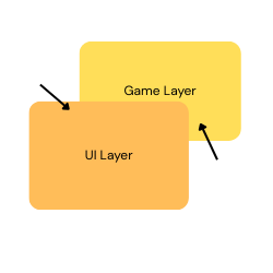
That means you can render any kind of heavy graphic within your application without sacrifying performance.
Core Features
- Built-in widgets including button, modal, text input and more.
- Leverages Bevy’s massive parallelism for smooth and efficient rendering.
- Routing systems.
- Custom styling with ID & Classes similar to HTML/CSS.
- High level API and flexible.
Installation
cargo add makara
Getting Start
IMPORTANT
Makara relies entire on Bevy’s UI system and ECS. When you use Makara, you’re actually using the Bevy engine, with Makara providing an abstraction for its UI system to help you build GUI applications with ease.
A solid understanding of Bevy’s ECS is required. If you’re new to Bevy, I recommend checking out Bevy’s quick start guide.
Getting Start
use makara::prelude::*;
use bevy::prelude::*;

fn main() {
    App::new()
        .add_plugins(MakaraPlugin::default())
        .add_systems(Startup, setup)
        .run();
}

fn setup(mut commands: Commands) {
    commands.spawn(
        root_!(
            align_items: AlignItems::Center,
            justify_content: JustifyContent::Center,

            [ text_!("Hello world", font_size: 20.0) ]
        )
    );
}
An overview of ECS
Because this library is powered by a game engine which is based on ECS architecture, it’s a must to understand how ECS works.
ECS stands for Entity-Component-System.
-
Entity: entities are objects you see when you run your application. A button widget is an entity, a text widget is an entity, the list goes on. Each entity consists of one or multiple components.
-
Component: think of component as a tag. It’s used to identify different kind of data. In the context of Makara or Bevy, component is just a rust struct or enum.
For example, you create a button with background color of red and border color of blue in Makara.
#![allow(unused)]
fn main() {
// create button with background color of red and border color of blue
button_!("Click me", background_color: "red", border_color: "blue");
}
Under the hood, the button is just an entity that contains these 2 components,
BackgroundColorandBorderColorwhich looks something like this.#![allow(unused)] fn main() { ( BackgroundColor(Color::srgb(1.0, 0.0, 0.0)), BorderColor(Color::srgb(0.0, 1.0, 0.0)), // other components ) }It’s then up to the Bevy engine to translate it to shading language and render it on your GPU.
-
System: systems are just rust functions that take specific arguments and run at specific schedule.
Startupschedule means the functions run only once at the beginning.Updateschedule means the functions run every single frame. And of course, there are more schedules than just that.fn main() { App::new() .add_plugins(MakaraPlugin::default()) .add_systems(Startup, setup) .run(); } fn setup(mut commands: Commands) { // do something }Here,
setupfunction is a system that take a special argument, in this caseCommands. It’s being registered to run atStartupschedule which means it only do something once and that’s it.
Understand Makara hierarchy
Just like any other UI frameworks, you need a starting point for your application. In Makara, you start by spawning a single root widget and add other widgets as children of root except modal.
In above example, when you run the application with cargo run you will see the text
“Hello world” appears at the center of the screen.
You can make a widget becomes a child of another widget by using [], we will talk about it later.
Widget Structure
Understanding the structure of widgets in Makara
In Makara, creating a widget can be done by calling its pre-defined macro.
A button can be created using button_! and a text can be created using text_!.
Each widget macro is splitted into 3 parts:
- Properties
- Event handlers
- Children array
For example,
#![allow(unused)]
fn main() {
scroll_!(
    // properties
    background_color: "red",
    border_radius: px(5),
    margin: px(5),
    padding: px(10),

    // event handlers (if there's any)
    on: |_scrolling: On<Scrolling>| {},
    on: |_built: On<WidgetBuilt>| {},

    // children array
    [
        button_!("Click me", background_color: "blue"),
        text_!("This is some text")
    ]
);
}
For event handlers, you can also create functions for it to make it cleaner.
#![allow(unused)]
fn main() {
scroll_!(
    // properties
    background_color: "red",
    border_radius: px(5),
    margin: px(5),
    padding: px(10),

    // event handlers (if there's any)
    on: handle_scrolling,
    on: handle_widget_built,

    // children array
    [
        button_!("Click me", background_color: "blue"),
        text_!("This is some text")
    ]
);

fn handle_scrolling(_scrolling: On<Scrolling>) {
    // do something
}

fn handle_widget_built(_built: On<WidgetBuilt>) {
    // do something
}
}
Widgets
Makara provides a comprehensive set of built-in widgets for building modern GUI applications. Each widget comes with styling options, event handling capabilities, and built-in class support for rapid development.
Container Widgets
Container widgets manage layout and can contain child elements.
Root
The root_! widget is the starting point for your UI hierarchy and must be spawned by commands. It supports alignment utility classes.
Basic Usage:
#![allow(unused)]
fn main() {
commands.spawn(root_!([
    text_!("Hello World")
]));
}
With styling and alignment:
#![allow(unused)]
fn main() {
commands.spawn(
    root_!(
        background_color: Color::srgb(0.1, 0.1, 0.2),
        class: "justify-center align-center p-4",

        [
            column_!([
                text_!("Welcome to Makara!"),
                button_!("Get Started")
            ])
        ]
    )
);
}
With custom properties:
#![allow(unused)]
fn main() {
commands.spawn(
    root_!(
        width: percent(100),
        height: percent(100),
        id: "main-container",
        class: "justify-between align-stretch",

        [/* children */]
    )
);
}
Column
The column_! widget arranges children vertically in a flexbox column layout.
Basic Usage:
#![allow(unused)]
fn main() {
column_!([
    text_!("Item 1"),
    text_!("Item 2"),
    text_!("Item 3")
])
}
With alignment and spacing:
#![allow(unused)]
fn main() {
column_!(
    class: "justify-center align-center p-4 m-2",
    background_color: "white",

    [
        text_!("Centered Column", font_size: 24.0),
        button_!("Action Button", class: "is-primary mt-3"),
        text_!("Footer text", class: "mt-2")
    ]
)
}
With event handling:
#![allow(unused)]
fn main() {
column_!(
    on: |_built: On<WidgetBuilt>| {
        println!("Column widget built!");
    },

    [/* children */]
)
}
Row
The row_! widget arranges children horizontally in a flexbox row layout.
Basic Usage:
#![allow(unused)]
fn main() {
row_!([
    text_!("Left"),
    text_!("Center"),
    text_!("Right")
])
}
Navigation bar example:
#![allow(unused)]
fn main() {
row_!(
    class: "justify-between align-center p-3",
    background_color: Color::srgb(0.2, 0.3, 0.8),

    [
        text_!("MyApp", font_size: 20.0, color: Color::WHITE),
        row_!(
            class: "justify-end align-center",

            [
                button_!("Home", class: "mr-2"),
                button_!("About", class: "mr-2"),
                button_!("Contact")
            ]
        )
    ]
)
}
Scroll
The scroll_! widget creates a scrollable container for content that exceeds the container size.
Basic Usage:
#![allow(unused)]
fn main() {
scroll_!([
    text_!("Line 1"),
    text_!("Line 2"),
    text_!("Line 3"),
    // ... many more lines
])
}
Styled scroll container:
#![allow(unused)]
fn main() {
scroll_!(
    width: px(300),
    height: px(200),
    class: "p-3",
    background_color: Color::srgb(0.95, 0.95, 0.95),

    [
        column_!(
            class: "justify-start align-stretch",

            [
                text_!("Scrollable Content", font_size: 18.0, class: "mb-2"),
                text_!("This is line 1"),
                text_!("This is line 2"),
                // ... more content
            ]
        )
    ]
)
}
With scroll event handling:
#![allow(unused)]
fn main() {
scroll_!(
    on: |scrolling: On<Scrolling>| {
        println!("User is scrolling!");
    },

    [/* scrollable content */]
)
}
Interactive Widgets
Button
The button_! widget provides clickable interactions with built-in hover states.
Basic Usage:
#![allow(unused)]
fn main() {
button_!("Click Me")
}
With styling:
#![allow(unused)]
fn main() {
button_!("Submit", class: "is-primary p-3 m-2")
}
With event handling:
#![allow(unused)]
fn main() {
button_!(
    "Save Data";
    on: |clicked: On<Clicked>| {
        println!("Save button clicked!");
    },
    on: |over: On<MouseOver>| {
        println!("Mouse over save button");
    },
    on: |out: On<MouseOut>| {
        println!("Mouse left save button");
    }
)
}
Complete example with styling and events:
#![allow(unused)]
fn main() {
button_!(
    "Delete Item",
    id: "delete-btn",
    class: "is-danger p-2 m-1",
    on: |clicked: On<Clicked>| {
        // Handle delete action
    },
    on: |built: On<WidgetBuilt>| {
        println!("Delete button ready!");
    }
)
}
Text Input
The text_input_! widget provides text entry with placeholder support and theming.
Basic Usage:
#![allow(unused)]
fn main() {
text_input_!("Enter your name...")
}
With styling and validation:
#![allow(unused)]
fn main() {
text_input_!(
    "Enter email address...",
    class: "is-primary p-2",
    width: px(300),
    id: "email-input"
)
}
With change event handling:
#![allow(unused)]
fn main() {
text_input_!(
    "Search...";
    on: |change: On<Change<String>>| {
        println!("Search text: {}", change.data);
    };
    on: |clicked: On<Clicked>| {
        println!("Input field focused");
    }
)
}
Form example:
#![allow(unused)]
fn main() {
column_!(
    class: "justify-start align-stretch p-4";
    [
        text_!("User Registration", font_size: 20.0, class: "mb-3"),
        text_input_!("Full Name...", class: "mb-2", width: px(300)),
        text_input_!("Email Address...", class: "is-info mb-2", width: px(300)),
        text_input_!("Password...", class: "is-warning mb-3", width: px(300)),
        button_!("Register", class: "is-success")
    ]
)
}
Checkbox
The checkbox_! widget provides boolean toggle functionality.
Basic Usage:
#![allow(unused)]
fn main() {
checkbox_!("Accept terms and conditions")
}
With styling:
#![allow(unused)]
fn main() {
checkbox_!("Enable notifications", class: "is-primary p-2")
}
With state change handling:
#![allow(unused)]
fn main() {
checkbox_!(
    "Subscribe to newsletter";
    on: |active: On<Active<String>>| {
        println!("Checkbox activated: {}", active.data);
    };
    on: |inactive: On<Inactive<String>>| {
        println!("Checkbox deactivated: {}", inactive.data);
    }
)
}
Settings panel example:
#![allow(unused)]
fn main() {
column_!(
    class: "justify-start align-start p-4";
    [
        text_!("Settings", font_size: 18.0, class: "mb-3"),
        checkbox_!("Dark mode", class: "is-info mb-2"),
        checkbox_!("Auto-save", class: "is-success mb-2"),
        checkbox_!("Show tooltips", class: "is-primary mb-2"),
        button_!("Apply Settings", class: "is-primary mt-2")
    ]
)
}
Radio Group & Radio
Radio widgets provide single-selection from multiple options.
Basic Usage:
#![allow(unused)]
fn main() {
radio_group_!([
    radio_!("Option A"),
    radio_!("Option B"),
    radio_!("Option C")
])
}
Payment method selector:
#![allow(unused)]
fn main() {
radio_group_!(
    class: "p-3";
    on: |change: On<Change<String>>| {
        println!("Selected payment method: {}", change.data);
    };
    [
        radio_!("Credit Card", class: "is-primary mb-2"),
        radio_!("PayPal", class: "is-info mb-2"),
        radio_!("Bank Transfer", class: "is-success mb-2"),
        radio_!("Cash on Delivery", class: "is-warning")
    ]
)
}
With individual radio event handling:
#![allow(unused)]
fn main() {
radio_group_!([
    radio_!(
        "Small Size";
        on: |active: On<Active>| {
            println!("Small size selected");
        }
    ),
    radio_!("Medium Size"),
    radio_!("Large Size")
])
}
Select
The select_! widget provides a dropdown selection interface.
Basic Usage:
#![allow(unused)]
fn main() {
select_!("Choose country...", choices: &["USA", "Canada", "Mexico"])
}
With styling and events:
#![allow(unused)]
fn main() {
select_!(
    "Select payment method...",
    choices: &["Credit Card", "Debit Card", "PayPal"],
    class: "is-primary p-2",
    width: px(250);
    on: |change: On<Change<String>>| {
        println!("Selected: {}", change.data);
    };
    on: |active: On<Active>| {
        println!("Dropdown opened");
    };
    on: |inactive: On<Inactive>| {
        println!("Dropdown closed");
    }
)
}
Form integration:
#![allow(unused)]
fn main() {
column_!(
    class: "justify-start align-stretch p-4";
    [
        text_!("Shipping Information"),
        select_!("Country...", choices: &["USA", "Canada", "UK"], class: "mb-2"),
        select_!("State/Province...", choices: &["CA", "NY", "TX"], class: "mb-2"),
        button_!("Continue", class: "is-success")
    ]
)
}
Dropdown
The dropdown_! widget creates a button that shows/hides child content.
Basic Usage:
#![allow(unused)]
fn main() {
dropdown_!(
    "Menu";
    [
        button_!("Profile"),
        button_!("Settings"),
        button_!("Logout")
    ]
)
}
Navigation dropdown:
#![allow(unused)]
fn main() {
dropdown_!(
    "Products",
    class: "is-primary";
    on: |clicked: On<Clicked>| {
        println!("Products dropdown toggled");
    };
    [
        button_!("Laptops", class: "mb-1"),
        button_!("Phones", class: "mb-1"),
        button_!("Tablets", class: "mb-1"),
        button_!("Accessories")
    ]
)
}
Slider
The slider_! widget provides numeric input via draggable control.
Basic Usage:
#![allow(unused)]
fn main() {
slider_!(min: 0.0, max: 100.0)
}
Volume control example:
#![allow(unused)]
fn main() {
column_!(
    class: "justify-start align-center p-4";
    [
        text_!("Volume Control", class: "mb-2"),
        slider_!(
            min: 0.0,
            max: 100.0,
            class: "is-primary p-2";
            on: |change: On<Change<f32>>| {
                println!("Volume: {:.1}%", change.data);
            }
        )
    ]
)
}
Settings panel with multiple sliders:
#![allow(unused)]
fn main() {
column_!(
    class: "justify-start align-stretch p-4";
    [
        text_!("Audio Settings", font_size: 18.0, class: "mb-3"),

        column_!(class: "mb-2"; [
            text_!("Master Volume"),
            slider_!(min: 0.0, max: 100.0, class: "is-primary")
        ]),

        column_!(class: "mb-2"; [
            text_!("Music Volume"),
            slider_!(min: 0.0, max: 100.0, class: "is-info")
        ]),

        column_!(class: "mb-2"; [
            text_!("Effects Volume"),
            slider_!(min: 0.0, max: 100.0, class: "is-success")
        ])
    ]
)
}
Display Widgets
Text
The text_! widget displays styled text content.
Basic Usage:
#![allow(unused)]
fn main() {
text_!("Hello World")
}
With styling:
#![allow(unused)]
fn main() {
text_!("Welcome!", font_size: 24.0, color: Color::srgb(0.2, 0.6, 0.8))
}
With classes:
#![allow(unused)]
fn main() {
text_!("Error message", class: "is-danger", font_size: 16.0)
}
Typography example:
#![allow(unused)]
fn main() {
column_!(
    class: "justify-start align-start p-4";
    [
        text_!("Main Heading", font_size: 32.0, class: "mb-3"),
        text_!("Subheading", font_size: 20.0, class: "is-info mb-2"),
        text_!("Regular paragraph text with some content.", font_size: 14.0, class: "mb-2"),
        text_!("Small caption text", font_size: 12.0, class: "is-secondary")
    ]
)
}
Image
The image_! widget displays images from file paths or URLs.
Basic Usage:
#![allow(unused)]
fn main() {
image_!("assets/logo.png")
}
With sizing:
#![allow(unused)]
fn main() {
image_!(
    "assets/hero-banner.jpg",
    width: px(400),
    height: px(200)
)
}
With events:
#![allow(unused)]
fn main() {
image_!(
    "assets/profile.png";
    on: |clicked: On<Clicked>| {
        println!("Profile image clicked");
    };
    on: |over: On<MouseOver>| {
        println!("Hovering over image");
    }
)
}
Image gallery example:
#![allow(unused)]
fn main() {
row_!(
    class: "justify-around align-center p-4";
    [
        image_!("assets/thumb1.jpg", width: px(150), height: px(150)),
        image_!("assets/thumb2.jpg", width: px(150), height: px(150)),
        image_!("assets/thumb3.jpg", width: px(150), height: px(150))
    ]
)
}
Link
The link_! widget creates clickable links that open in the browser.
Basic Usage:
#![allow(unused)]
fn main() {
link_!("https://rust-lang.org/")
}
With custom text:
#![allow(unused)]
fn main() {
link_!("Visit Rust Website", url: "https://rust-lang.org/")
}
With styling and events:
#![allow(unused)]
fn main() {
link_!(
    "Documentation",
    url: "https://docs.rs/makara",
    class: "is-primary";
    on: |clicked: On<Clicked>| {
        println!("Documentation link clicked");
    }
)
}
Footer links example:
#![allow(unused)]
fn main() {
row_!(
    class: "justify-center align-center p-3";
    [
        link_!("Privacy Policy", url: "https://example.com/privacy", class: "mr-4"),
        link_!("Terms of Service", url: "https://example.com/terms", class: "mr-4"),
        link_!("Contact Us", url: "https://example.com/contact")
    ]
)
}
Progress & Loading Widgets
Progress Bar
The progress_bar_! widget shows linear progress indication.
Basic Usage:
#![allow(unused)]
fn main() {
progress_bar_!()
}
With styling:
#![allow(unused)]
fn main() {
progress_bar_!(
    class: "is-primary p-2",
    width: px(300)
)
}
With progress tracking:
#![allow(unused)]
fn main() {
progress_bar_!(
    class: "is-success";
    on: |change: On<Change<f32>>| {
        println!("Progress: {:.1}%", change.data * 100.0);
    }
)
}
Loading interface example:
#![allow(unused)]
fn main() {
column_!(
    class: "justify-center align-center p-4";
    [
        text_!("Loading...", class: "mb-2"),
        progress_bar_!(class: "is-info", width: px(250)),
        text_!("Please wait while we process your request",
               font_size: 12.0, class: "mt-2")
    ]
)
}
Circular
The circular_! widget shows circular/spinner progress indication.
Basic Usage:
#![allow(unused)]
fn main() {
circular_!()
}
With styling:
#![allow(unused)]
fn main() {
circular_!(
    class: "is-primary p-3",
    width: px(50),
    height: px(50)
)
}
Loading spinner example:
#![allow(unused)]
fn main() {
column_!(
    class: "justify-center align-center p-4";
    [
        circular_!(class: "is-info mb-3"),
        text_!("Processing...", class: "is-info")
    ]
)
}
Modal
The modal_! widget creates overlay dialogs and is independent of the root widget hierarchy.
Basic Usage:
#![allow(unused)]
fn main() {
commands.spawn(
    modal_!([
        column_!([
            text_!("Are you sure?"),
            button_!("Confirm")
        ])
    ])
);
}
Confirmation dialog:
#![allow(unused)]
fn main() {
modal_!(
    on: |active: On<Active>| {
        println!("Modal opened");
    };
    on: |inactive: On<Inactive>| {
        println!("Modal closed");
    };
    [
        column_!(
            class: "justify-center align-center p-4",
            background_color: Color::WHITE,
            width: px(300),
            height: px(200);
            [
                text_!("Delete Confirmation", font_size: 18.0, class: "mb-3"),
                text_!("Are you sure you want to delete this item?", class: "mb-4"),
                row_!(
                    class: "justify-center align-center";
                    [
                        button_!("Cancel", class: "is-secondary mr-2"),
                        button_!("Delete", class: "is-danger")
                    ]
                )
            ]
        )
    ]
)
}
Settings modal:
#![allow(unused)]
fn main() {
modal_!([
    column_!(
        class: "justify-start align-stretch p-4",
        background_color: Color::WHITE,
        width: px(400),
        height: px(500);
        [
            text_!("Settings", font_size: 24.0, class: "mb-4"),

            checkbox_!("Enable notifications", class: "mb-2"),
            checkbox_!("Auto-save documents", class: "mb-2"),

            text_!("Theme", class: "mb-1"),
            select_!("Choose theme...", choices: &["Light", "Dark", "Auto"], class: "mb-4"),

            row_!(
                class: "justify-end align-center";
                [
                    button_!("Cancel", class: "mr-2"),
                    button_!("Save", class: "is-primary")
                ]
            )
        ]
    )
])
}
Built-in Classes
All widgets support built-in utility classes:
Color Classes
is-primary,is-primary-darkis-link,is-link-darkis-info,is-info-darkis-success,is-success-darkis-warning,is-warning-darkis-danger,is-danger-dark
Spacing Classes (Container widgets only)
- Margin:
m-0tom-6,mt-2,mr-3,mb-1,ml-4,mx-2,my-3 - Padding:
p-0top-6,pt-2,pr-3,pb-1,pl-4,px-2,py-3
Alignment Classes (Container widgets only)
- Justify:
justify-start,justify-center,justify-end,justify-between,justify-around,justify-evenly - Align:
align-start,align-center,align-end,align-stretch,align-baseline
Complete Example
Here’s a complete application example using multiple widgets:
#![allow(unused)]
fn main() {
use makara::prelude::*;
use bevy::prelude::*;

fn setup(mut commands: Commands) {
    commands.spawn(
        root_!(
            class: "justify-center align-center p-4",
            background_color: Color::srgb(0.9, 0.9, 0.9);
            [
                column_!(
                    class: "justify-start align-stretch p-4",
                    background_color: Color::WHITE,
                    width: px(500);
                    [
                        // Header
                        text_!("User Profile", font_size: 24.0, class: "mb-4"),

                        // Profile image
                        row_!(
                            class: "justify-center align-center mb-4";
                            [
                                image_!("assets/avatar.png", width: px(100), height: px(100))
                            ]
                        ),

                        // Form fields
                        text_input_!("Full Name...", class: "mb-2"),
                        text_input_!("Email...", class: "is-info mb-2"),

                        // Preferences
                        text_!("Preferences", font_size: 16.0, class: "mb-2"),
                        checkbox_!("Email notifications", class: "mb-1"),
                        checkbox_!("Dark mode", class: "mb-3"),

                        // Theme selection
                        select_!("Theme...", choices: &["Light", "Dark", "Auto"], class: "mb-4"),

                        // Actions
                        row_!(
                            class: "justify-end align-center";
                            [
                                button_!("Cancel", class: "mr-2"),
                                button_!("Save Profile", class: "is-primary")
                            ]
                        )
                    ]
                )
            ]
        )
    );
}
}
For detailed API documentation, visit the Rust docs.
Querying Widgets
Each widget type has its own query and blueprint. Once widgets are built, you can query any widgets within systems using its corresponding query struct.
For example, let’s say we have a text and a button. Once the button is clicked, we want to update the text.
#![allow(unused)]
fn main() {
column_!([
    text_!("Hello world", id: "my-text"),
    button_!("Click me"; on: |_clicked: On<Clicked>, mut text_q: TextQuery| {
        if let Some(text) = text_q.find_by_id("my-text") {
            text.text.value.0 = "Hello Mom".to_string();
        }
    })
]);
}
In the example above, once the button is clicked, we query text widgets using TextQuery.
We then find the specific widget using its id. This is similar to how javascript finds
HTML elements within the DOM.
Of course, you can query a widget using class or entity instead of id. Querying with class is useful if you want to fetch multiple widgets at same time, but requires you to write extra code.
#![allow(unused)]
fn main() {
// change all text colors when button is clicked.
column_!([
    text_!("Hello world", class: "my-text"),
    text_!("Hello mom", class: "my-text"),
    text_!("Hello friend", class: "my-text"),
    text_!("Hello stranger", class: "my-text"),

    button_!("Click me"; on: |_clicked: On<Clicked>, mut text_q: TextQuery| {
        // find_by_class returns list of entity
        let text_entities = text_q.find_by_class("my-text");

        // iterate thru the list
        for entity in text_entities.into_iter() {
            if let Some(text) = text_q.find_by_entity(entity) {
                text.text.color.0 = Color::RED;
            }
        }
    })
]);
}
For more information about widget query and its blueprint, see widgets.
Styling
Styling in Makara
There are 2 ways to provide custom styles to widgets.
- Style on widgets directly using properties.
- Attach an
IDorClassesand provide styles viaIDorClasses.
Direct styling
fn main() {
    App::new()
        .add_plugins(MakaraPlugin::default())
        .add_systems(Startup, setup)
        .run();
}

fn setup(mut commands: Commands) {
    commands.spawn(
        root_!(
            align_items: AlignItems::Center, // direct styling
            justify_content: JustifyContent::Center; // direct styling

            [ text_!("Hello world", font_size: 20.0) ]
        )
    );
}
With ID and Classes
fn main() {
    App::new()
        .add_plugins(MakaraPlugin::default())
        .add_systems(Startup, (setup, setup_styles)) // add this
        .run();
}

fn setup(mut commands: Commands) {
    commands.spawn(
        root_!(id: "root"; [
            text_!("Hello world", id: "text-one", class: "text"),
            text_!("Hello mom", class: "text"),
            text_!("Hello friend", class: "text hello-friend"),
            text_!("Hello stranger", class: "text")
        ])
    );
}

fn setup_styles(mut style: ResMut<CustomStyle>) {
    // via id
    style.bind_id(
        "root",
        Style::new()
            .align_items(AlignItems::Center)
            .justify_content(JustifyContent::Center)
    );

    // via id
    style.bind_id("text-one", Style::new().color("red"));

    // via class
    style.bind_class(
        "text",
        Style::new().font_size(20.0)
    );

    // via class
    style.bind_class(
        "hello-friend",
        Style::new().color("blue")
    );
}
When you run the application:
rootwill getAlignItemsandJustifyContentstyles.- all
textswill havefont_sizeof20.0. - only one
textwith idtext-onewill havecolorofred. - only one
textwith classhello-friendwill havecolorofblue.
See Style API for more info.
Alignment Utility Classes
Makara provides a comprehensive set of alignment utility classes that allow you to control the layout and positioning of widgets without writing custom styles. These classes follow CSS flexbox conventions and work similarly to utility frameworks like Tailwind CSS.
Justify Content Classes
Justify content classes control the alignment of child elements along the main axis (horizontal for rows, vertical for columns).
| Class Name | Alternative | Effect |
|---|---|---|
justify-start | justify-content-start | Align children to the start of the main axis |
justify-center | justify-content-center | Center children along the main axis |
justify-end | justify-content-end | Align children to the end of the main axis |
justify-between | justify-content-between | Distribute children with equal space between them |
justify-around | justify-content-around | Distribute children with equal space around them |
justify-evenly | justify-content-evenly | Distribute children with equal space around and between them |
justify-stretch | justify-content-stretch | Stretch children to fill the main axis |
Align Items Classes
Align items classes control the alignment of child elements along the cross axis (vertical for rows, horizontal for columns).
| Class Name | Alternative | Effect |
|---|---|---|
align-start | align-items-start | Align children to the start of the cross axis |
align-center | align-items-center | Center children along the cross axis |
align-end | align-items-end | Align children to the end of the cross axis |
align-stretch | align-items-stretch | Stretch children to fill the cross axis |
align-baseline | align-items-baseline | Align children along their baseline |
Align Content Classes
Align content classes control the alignment of wrapped lines when there are multiple rows/columns of content.
| Class Name | Effect |
|---|---|
align-content-start | Align wrapped lines to the start |
align-content-center | Center wrapped lines |
align-content-end | Align wrapped lines to the end |
align-content-stretch | Stretch wrapped lines to fill the container |
align-content-between | Distribute wrapped lines with equal space between them |
align-content-around | Distribute wrapped lines with equal space around them |
align-content-evenly | Distribute wrapped lines with equal space around and between them |
Usage Examples
Basic Centering
#![allow(unused)]
fn main() {
// Center content both horizontally and vertically
root_!(
    class: "justify-center align-center";
    [ text_!("Centered content") ]
)
}
Button Layout
#![allow(unused)]
fn main() {
// Distribute buttons evenly across a row
row_!(
    class: "justify-between align-center";
    [
        button_!("Cancel"),
        button_!("Submit")
    ]
)
}
Card Layout
#![allow(unused)]
fn main() {
// Create a vertically centered card with content aligned to start
column_!(
    class: "justify-center align-start p-4";
    [
        text_!("Card Title", font_size: 18.0),
        text_!("Card content goes here..."),
        button_!("Action", class: "mt-3")
    ]
)
}
Navigation Bar
#![allow(unused)]
fn main() {
// Create a navigation bar with logo on left, menu on right
row_!(
    class: "justify-between align-center p-3";
    [
        text_!("Logo", font_size: 20.0),
        row_!(
            class: "justify-end align-center";
            [
                button_!("Home", class: "mr-2"),
                button_!("About", class: "mr-2"),
                button_!("Contact")
            ]
        )
    ]
)
}
Grid-like Layout
#![allow(unused)]
fn main() {
// Create a grid of items with even spacing
column_!(
    class: "justify-start align-stretch";
    [
        row_!(
            class: "justify-around align-center mb-4";
            [
                button_!("Item 1"),
                button_!("Item 2"),
                button_!("Item 3")
            ]
        ),
        row_!(
            class: "justify-around align-center";
            [
                button_!("Item 4"),
                button_!("Item 5"),
                button_!("Item 6")
            ]
        )
    ]
)
}
Combining with Other Classes
Alignment classes work seamlessly with other built-in utility classes:
#![allow(unused)]
fn main() {
// Combine alignment with spacing and color classes
column_!(
    class: "justify-center align-center p-4 m-2";
    background_color: Color::WHITE;
    [
        text_!("Welcome!", class: "mb-3", font_size: 24.0),
        button_!("Get Started", class: "is-primary")
    ]
)
}
Responsive Considerations
While Makara doesn’t have built-in responsive breakpoints like web CSS frameworks, you can dynamically change classes based on window size or other conditions in your Bevy systems:
#![allow(unused)]
fn main() {
fn adjust_layout_system(
    mut commands: Commands,
    windows: Query<&Window>,
    mut widgets: Query<(Entity, &mut Class), With<SomeWidget>>
) {
    if let Ok(window) = windows.get_single() {
        for (entity, mut class) in widgets.iter_mut() {
            if window.width() < 600.0 {
                // Mobile layout
                class.set("justify-center align-center".to_string());
            } else {
                // Desktop layout
                class.set("justify-between align-center".to_string());
            }
        }
    }
}
}
Supported Widgets
Alignment utility classes are supported on container widgets that manage child element layout:
root_!()- Main application containerrow_!()- Horizontal flex containercolumn_!()- Vertical flex containerscroll_!()- Scrollable container
Other widgets like button_!(), text_!(), image_!(), etc. have fixed internal layouts and don’t support alignment classes since they’re not intended to be containers for user-defined child elements.
Performance Notes
- Alignment classes are processed during widget build and when the class attribute changes
- No runtime overhead once the layout is computed
- Classes are parsed once and cached until the class attribute is modified
- Bevy’s layout system handles the actual positioning efficiently
Migration from Manual Styling
If you were previously setting alignment properties manually:
#![allow(unused)]
fn main() {
// Old way
root_!(
    justify_content: JustifyContent::Center,
    align_items: AlignItems::Center;
    [ /* children */ ]
)

// New way with utility classes
root_!(
    class: "justify-center align-center";
    [ /* children */ ]
)
}
The utility class approach provides the same functionality with more concise syntax and better consistency across your application.
Routing
Routing
Routing in Makara is really easy. There are only 3 steps.
- Specifying route name on
rootwidget. - Register route.
- Navigating.
Specifying route
Just like I mentioned in previous chapter about hierarchy,
we need to use root widget as a starting point for UI hierarchy.
If you want to have multiple pages or views, you need to create multiple starting points. In other words,
each root defines one page or view.
For example, let’s say you want to have Home view and About Us view.
fn main() {
    App::new()
        .add_plugins(MakaraPlugin::default())
        .add_systems(Startup, (setup_home_view, setup_about_us_view))
        .run();
}

fn setup_home_view(mut commands: Commands) {
    commands.spawn(
        root_!(route: "home"; [ text_!("This is home view") ])
    );
}

fn setup_about_us_view(mut commands: Commands) {
    commands.spawn(
        root_!(route: "about-us"; [ text_!("This is about us view") ])
    );
}
We can specify route name for each view by using route property.
Registering Routes
After we defined route on each view, we need to register those routes.
We can do so by using Router resource.
fn main() {
    App::new()
        .add_plugins(MakaraPlugin::default())
        .add_systems(Startup, (
            setup_home_view,
            setup_about_us_view,
            setup_routes // add here
        ))
        .run();
}

fn setup_routes(mut router: ResMut<Router>) {
    router.register_routes(["home", "about-us"]);

    // define which route you want to see when the application started
    router.default_route("home", ());
}

// setup view systems..
You may also want to set the default route. If you don’t, the first route in the list will be set to default automatically.
Route Navigation
Let’s update the above examples to demonstrate how to nagivate to specific route.
#![allow(unused)]
fn main() {
fn setup_home_view(mut commands: Commands) {
    commands.spawn(
        root_!(route: "home"; [
            text_!("This is home view"),
            button_!(
                "Go to about us view";
                on: |_clicked: On<Clicked>, mut router: ResMut<Router>| {
                    navigate_!(router, "about-us");
                }
            )
        ])
    );
}

fn setup_about_us_view(mut commands: Commands) {
    commands.spawn(
        root_!(route: "about-us"; [
            text_!("This is about us view"),
            button_!(
                "Go to home view";
                on: |_clicked: On<Clicked>, mut router: ResMut<Router>| {
                    navigate_!(router, "home");
                }
            )
        ])
    );
}
}
We can navigate to any route by calling navigate method.
Route Params
Of course, each route can have one or multiple params.
For example, let’s say we have a view called product-detail, but this view is dynamic based on product id or name.
#![allow(unused)]
fn main() {
fn setup_home_view(mut commands: Commands) {
    commands.spawn(
        root_!(route: "home"; [
            text_!("This is home view"),
            button_!(
                "See product";
                on: |_clicked: On<Clicked>, mut router: ResMut<Router>| {
                    navigate_!(
                        router,
                        "product-detail",
                        Param::new()
                            .value("id", "1234") // just random product id
                            .value("name", "Iphone 17 256GB") // product name
                    )
                }
            )
        ])
    );
}

fn setup_product_detail_view(mut commands: Commands) {
    commands.spawn(
        root_!(
            route: "product-detail";

            on: |page_loaded: On<PageLoaded>, mut text_q: TextQuery| {
                if let Some(text) = text_q.find_by_id("product-name") {
                    if let Some(name) = page_loaded.param.get("name") {
                        text.text.value.0 = name.clone();
                    }
                }
            };

            [ text_!("Product name: Unknown", id: "product-name") ]
        )
    );
}
}
See Router and Param for more info.
Organizing your project
Organizing your project
UI hierarchy can become verbosity and hard to keep track of. It’s always recommended to seperate your code into snippets.
For example,
use makara::prelude::*;
use bevy::prelude::*;

fn main() {
    App::new()
        .add_plugins(MakaraPlugin::default())
        .add_systems(Startup, setup)
        .run();
}

fn setup(mut commands: Commands) {
    commands.spawn(
        root_!(
            align_items: AlignItems::Center,
            justify_content: JustifyContent::Center;

            [
                text_!("Register your info"),
                input_container(),
                button_container()
            ]
        )
    );
}

fn input_container() -> impl Bundle {
    column_!([
        text_input_!("Enter email"),
        text_input_!("Enter name"),
        text_!("Choose gender"),
        radio_group_!([ radio_!("Male"), radio_!("Female") ])
    ])
}

fn button_container() -> impl Bundle {
    row_!([
        button_!("Cancel"; on: |_clicked: On<Clicked>| {}),
        button_!("Submit"; on: |_clicked: On<Clicked>| {})
    ])
}